[Android] Gemini Chat App (2)
https://treeralph.tistory.com/7 이후에 계속해서 진행해 보자.
일반적인 채팅 어플 포맷으로 이전 메시지를 확인할 수 있도록 하려고 하므로
Column에 LazyColumn을 추가해 주도록 하자.
그리고 앱 상단에 배치했던 TextField의 위치를 앱 하단으로 바꾸어주기 위해서
Column내부에 LazyColumn을 weight을 주어 배치하고 아래에 TextField를 위치시키도록 하자.
@OptIn(ExperimentalMaterial3Api::class)
@Composable
fun MainComposable(
    viewModel: MainViewModel = viewModel(),
) {
    Scaffold {
        Column(modifier = Modifier.fillMaxSize()) {
            LazyColumn(
                modifier = Modifier
                    .padding(it)
                    .weight(1f)
            ) {

            }
            OutlinedTextField(
                modifier = Modifier.fillMaxWidth(),
                value = viewModel.request.observeAsState(initial = "").value,
                onValueChange = viewModel.onTextChange,
                label = { Text(text = "To Gemini...") },
                trailingIcon = {
                    IconButton(onClick = { viewModel.buttonClickAction() }) {
                        Icon(imageVector = Icons.Filled.Send, contentDescription = "")
                    }
                }
            )
        }
    }
}
채팅 메세지의 필자를 구분하는 과정이 필요하므로 메시지와 필자를 묶어주는 Data class 하나 만들어주자.
data class Message(
    var role: Int,
    var message: String,
) {
    companion object {
        const val USER_ROLE = 0
        const val MODEL_ROLE = 1
    }
}
그리고 Message를 표현할 Composable 또한 필요하니 하나 만들어 주자.
ROLE에 따라서 배치, 색 정도를 바꾸어 구분되도록 해주자.
@Composable
fun MessageCard(
    modifier: Modifier = Modifier,
    message: Message,
) {
    Row {
    	/** USER_ROLE의 경우 우측, MODEL_ROLE의 경우 좌측에 배치하기 위해 */
        if(message.role == Message.USER_ROLE) Spacer(modifier = Modifier.weight(1f))
        ElevatedCard(
            modifier = modifier
                .requiredWidthIn(min = 50.dp, max = 320.dp)
                .padding(16.dp),
            colors = CardDefaults.elevatedCardColors(
                containerColor = if (message.role == Message.USER_ROLE) {
                    MaterialTheme.colorScheme.primaryContainer
                } else MaterialTheme.colorScheme.tertiaryContainer
            )
        ) {
            Text(
                modifier = Modifier.padding(12.dp),
                text = message.text
            )
        }
    }
}
이전에 사용하던 gemini 모델 api는 멀티턴 기능을 제공하지 않기 때문에 지금에 맞게 구성해 주자.
이 api 또한 https://ai.google.dev/tutorials/android_quickstart?hl=ko#multi-turn-conversations-chat 에서
사용법을 확인할 수 있다.
그리고 채팅 배열을 다루면서 history가 추가될 때 Composition이 적절히 잘 발생하도록
_responses를 mutableStateList로 설정해 주자.
class MainViewModel : ViewModel() {

    private val _request = MutableLiveData<String>()
    private val _responses = mutableStateListOf<Message>()
    private val _generativeModel = GenerativeModel(
        modelName = "gemini-pro",
        apiKey = /* YOUR API KEY */
    )
    private val _chat: Chat = _generativeModel.startChat(
        history = listOf(
            content(role = "user") { text("안녕, 넌 내 안드로이드 개발 조수야.") },
            content(role = "model") { text("알겠습니다. 성실히 답변하겠습니다.") }
        )
    )
    val request: LiveData<String> = _request
    val responses: List<Message> = _responses

    val onTextChange: (String) -> Unit = { _request.value = it }

    fun buttonClickAction() {
        viewModelScope.launch(Dispatchers.IO) {
            _responses.add(Message(role = Message.USER_ROLE, text = _request.value ?: ""))
            _request.postValue("")
            _chat.sendMessage(_request.value ?: "").let {
                _responses.add(Message(role = Message.MODEL_ROLE, text = it.text ?: ""))
            }
        }
    }
}
이제 마지막 단계이다.
viewmodel의 responses를 사용하여 MainComposable LazyColumn에 MessageCard Composable을 배치해 주자.
@OptIn(ExperimentalMaterial3Api::class)
@Composable
fun MainComposable(
    viewModel: MainViewModel = viewModel(),
) {
    Scaffold {
        Column(modifier = Modifier.fillMaxSize()) {
            LazyColumn(
                modifier = Modifier
                    .padding(it)
                    .weight(1f)
            ) {
            	/** MessageCard 적용해주기 */
                items(viewModel.responses) { response ->
                    MessageCard(message = response)
                }
                //
            }
            OutlinedTextField(
                modifier = Modifier.fillMaxWidth(),
                value = viewModel.request.observeAsState(initial = "").value,
                onValueChange = viewModel.onTextChange,
                label = { Text(text = "To Gemini...") },
                trailingIcon = {
                    IconButton(onClick = { viewModel.buttonClickAction() }) {
                        Icon(imageVector = Icons.Filled.Send, contentDescription = "")
                    }
                }
            )
        }
    }
}
그리고 다크테마를 좋아하니 다크테마만 적용되도록 조금만 변경해 주자.
ui.theme.Theme.kt에서 아래와 같이 수정해 주자.
@Composable
fun ETCTheme(
    darkTheme: Boolean = isSystemInDarkTheme(),
    // Dynamic color is available on Android 12+
    dynamicColor: Boolean = true,
    content: @Composable () -> Unit
) {
//    val colorScheme = when {
//        dynamicColor && Build.VERSION.SDK_INT >= Build.VERSION_CODES.S -> {
//            val context = LocalContext.current
//            if (darkTheme) dynamicDarkColorScheme(context) else dynamicLightColorScheme(context)
//        }
//
//        darkTheme -> DarkColorScheme
//        else -> LightColorScheme
//    }
    val colorScheme = DarkColorScheme
    val view = LocalView.current
    if (!view.isInEditMode) {
        SideEffect {
            val window = (view.context as Activity).window
            window.statusBarColor = colorScheme.primary.toArgb()
            WindowCompat.getInsetsController(window, view).isAppearanceLightStatusBars = darkTheme
        }
    }

    MaterialTheme(
        colorScheme = colorScheme,
        typography = Typography,
        content = content
    )
}
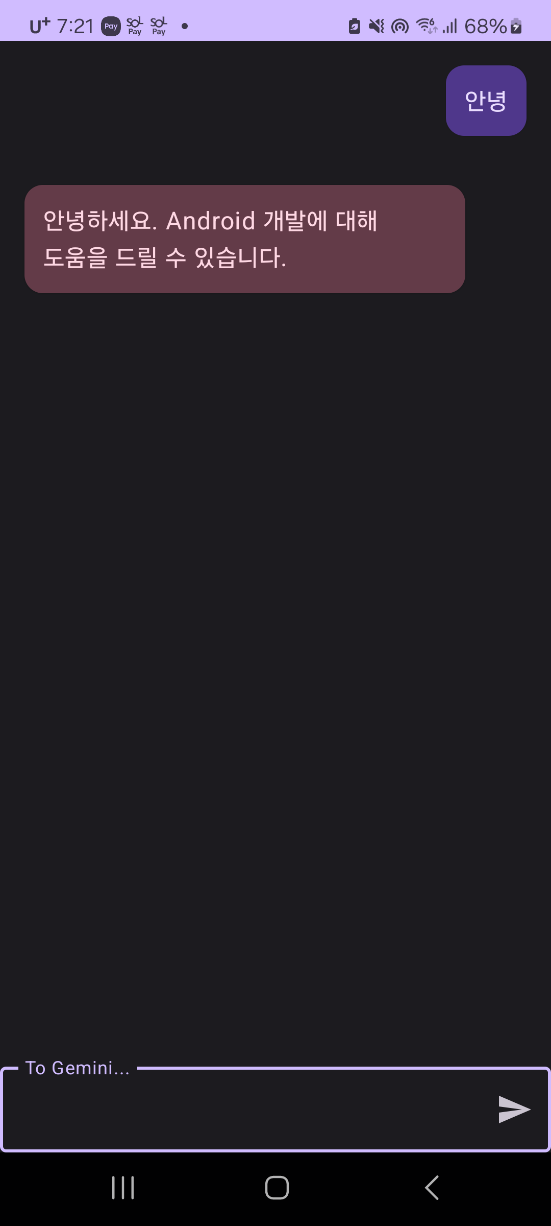
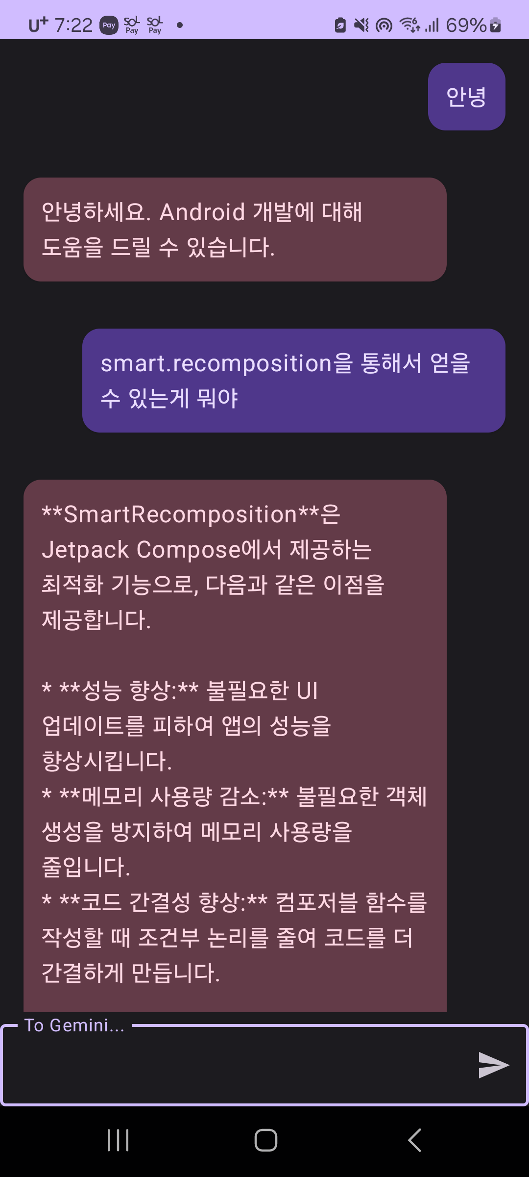
이제 실행해 보자.
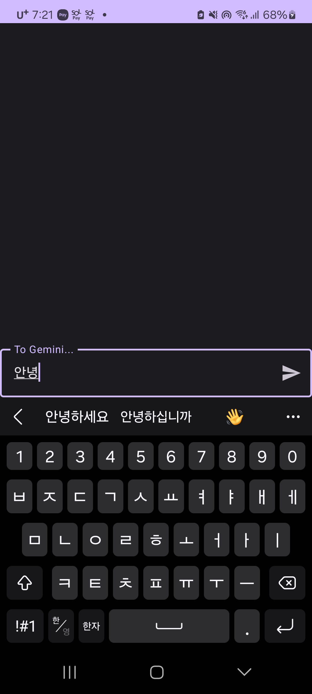 |
 |
 |
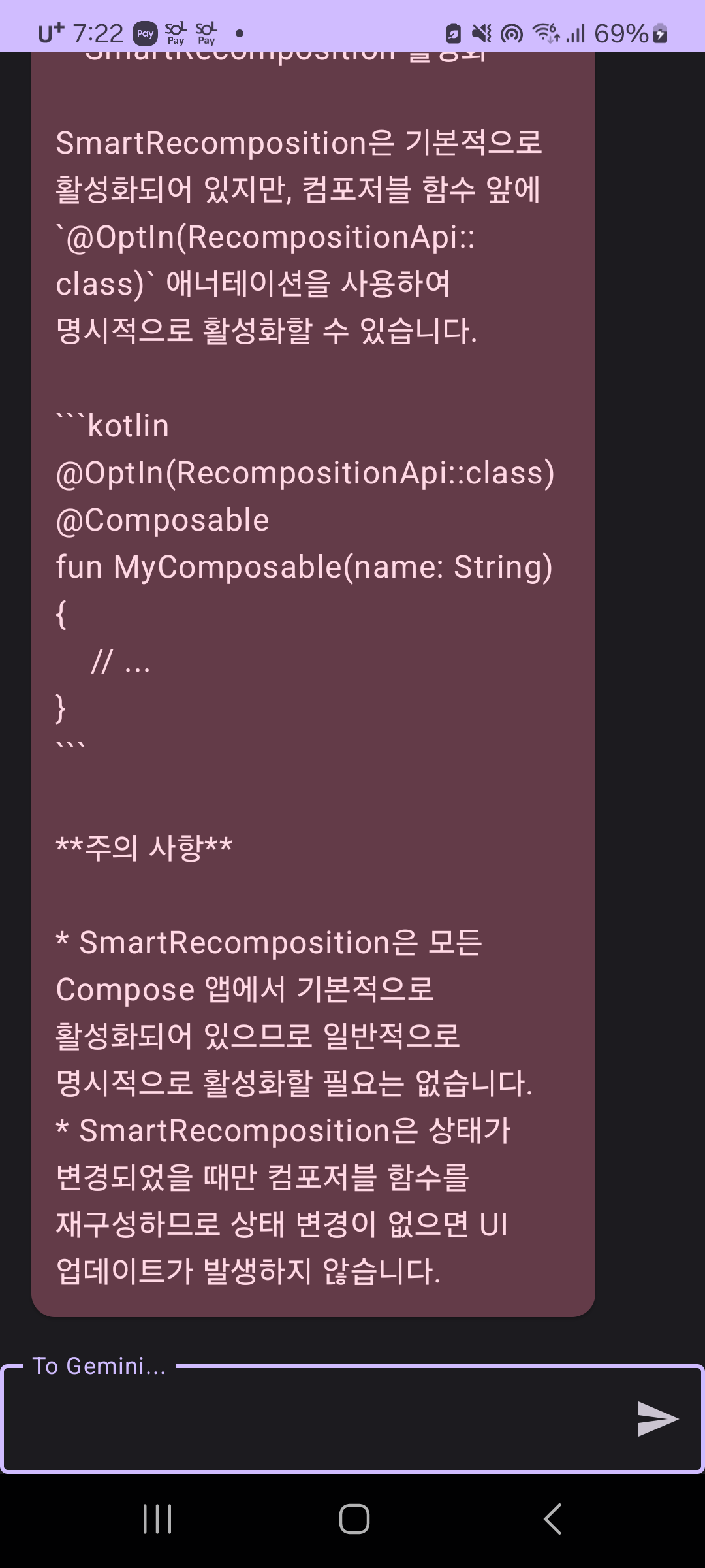 |
아직 까지는 문제 없는 것 같다.
조금 더 사용해 보면서 문제가 있는지 찾아보도록 하자.